New climate change map adds a new factor: people
Loading...
A new map adds a new variable to assessments of the regional impact of climate change: people.
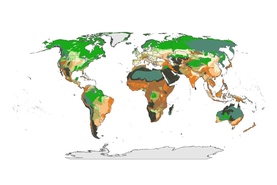
In making the new map, published this week in the scientific journal Nature Climate Change, a team of scientists have factored humans’ modifications to their environment into a new calculation of the relative threats that climate change poses to the world’s different regions.
These alterations to the world’s landscapes – seen in burgeoning cities, industrial centers, and farmland – have already weakened certain regional ecosystems, putting them at a disadvantage as manmade changes to the global climate begin to tax the planet. In plotting which of the world’s ecosystems have already been pummeled with human development, the team says the map could help conservationists make difficult calls about where to funnel finite resources.
“For the first time, this map places climate change within a human context,” says James Watson, director of the Climate Change Program at the Wildlife Conservation Society and lead author on the paper. “It answers the question: how will climate change interact with how we have already modified the environment?”
The map comes just two weeks before the Intergovernmental Panel on Climate Change will release its much anticipated report, published every four years, on the state of global warming. A draft of the report leaked to Reuters in August had said that scientists were 95 percent certain that humans are to blame for global climate change.
The new map builds on a roster of existing work analyzing how various ecosystems will weather climate change. But the paper also adds a new variable to the map: how much those landscapes, and their ecosystems, have been modified. That anthropogenic variable, while included in some local case studies analyzing climate change, has been absent from broad portraits painting the regional effects of climate change, says Dr. Watson.
But once added, the authors say, the variable offers a more useful and accurate gauge of just how susceptible a region is to a changing climate – experienced at some locations in warmer temperatures, at others in colder temperatures, and at others still in super-storms, prolonged droughts, ebbing coastlines, and economically-taxing species loss.
“Within the context of conservation practice, vegetation intactness is more significant than climate stability for ecosystem vulnerability,” write the authors, in the paper.
And, once the relative intactness of the ecosystem is considered, the climate change map looks radically different than previous such maps, the researchers say.
“Normally, the map shows high vulnerability at the high latitude or high altitude areas,” says Watson.
But on this new map, regions not traditionally denoted as vulnerable, like Southeast Asia, parts of eastern South America, and slivers of the US’s Midwest, are now swathed in the pale cream color that symbolizes a ecosystem that has already been cut into and destabilized, given high levels of human development in the area. These highly modified landscapes, which are also extremely exposed to climate change, lack the critical ability to adapt to changes in local conditions, compounding the already likely to be severe effects of climate change, says Watson.
Western and Central Europe are also classified on the new map as vulnerable regions, given their countries’ high latitudes and booming cities.
Meanwhile, regions once thought to be at risk for climate change devastation have now been replotted in a dark grey color indicating landscapes that have been on the whole untouched, bustling with robust species populations and functional ecosystems that make the area well placed to rebound from the toll that climate change could take. At the same time, these regions are relatively protected from the effects of climate change.
The new additions to the list of least vulnerable regions include the peaks of the Andes and swaths of eastern Russia. Other regions classified as least vulnerable are the Middle East and the Sahel region.
The map also denotes regions that satisfy one variable but not the other: regions with low exposure to climate change but also low levels of vegetation intactness are marked in dark orange, while regions with high exposure to climate change but also high vegetation intactness are colored in dark green.
The new map provides guidelines for where in the world conservations should marshal their efforts – not toward the most vulnerable areas, but to the least vulnerable, where the ecosystems are intact enough that staving off the effects of climate change is possible, says Watson.
“There’s still hope for protecting the stable areas, and that’s where we should be working first and foremost,” says Watson.
That does not mean, though, that the most vulnerable regions should be left to themselves. Highlighting the point that no two of Earth’s regions will bear the effects of climate change the same, the paper also broadly outlines which conservation strategies might be effective in each of the four regions identified based on the degree of environmental degradation and expected exposure to climate change.
The map comes two weeks after the publication of a massive report that also analyzed climate change for anthropogenic contributions. In that report, the scientists plumbed 12 extreme weather events from 2012 for the degree to which human factors contributed to the disasters, finding that about half the events had anthropogenic underpinnings. Among the events in which humans were contributing factors was Hurricane Sandy, which in part derived its unusual force from high sea levels that sent tides ballooning over the US’s East Coast, the researchers said.


