Nutritional coup: 'My Plate' replaces USDA food pyramid
Loading...
Goodbye food pyramid, and hello "My Plate."
The US Department of Agriculture, with an assist from first lady Michelle Obama, launched a new visual guide designed to help Americans have balanced diets in an era of high concern about obesity among adults and children.
As familiar as the food pyramid has been to generations of Americans, the USDA and the US surgeon general decided that a chart shaped like a dinner plate would better serve as a dietary guide.
"The new icon is simple and easy to understand, with more emphasis placed on fruits and vegetables," Surgeon General Regina Benjamin said in a statement released Thursday. "This new tool can be a fun way to help individuals and families make healthier meal choices."
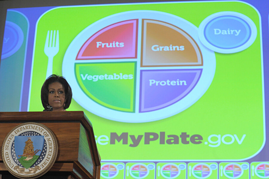
The plate-shaped diagram, essentially in the form of a pie chart, may give Americans an easier way to envision a mix of food groups on plates or in bowls.
"As a mom, I can already tell how much this is going to help parents across the country," said Mrs. Obama in helping to launch the chart. "When mom or dad comes home from a long day of work, we're already asked to be a chef, a referee, a cleaning crew. So it's tough to be a nutritionist, too. But we do have time to take a look at our kids' plates."
The food groups have been rearranged in an effort at user-friendly design. Dairy products, although considered an important food group, have been moved to the side in a round circle evocative of a glass of milk. The image of a fork sits handily to the left of the "central plate."
The image may give dairy products too little play. The USDA recommends about three cups of dairy products a day for most people, the same as the recommended amount of vegetables. In the new iconography, vegetables look bigger. And some people may focus more on the plate than on that cup of dairy on the side.
The new chart leaves out a couple of elements seen in recent year's on the pyramid: A small separate category for fats and oils, and an image of a person climbing (on the old pyramid) to symbolize physical exercise alongside eating.
A website called choosemyplate.gov provides more detailed guidance on the diet advice behind the new chart. Oils, it turns out, "are NOT a food group, but they provide essential nutrients." Recommended amounts of specific food groups differ a bit depending on whether the eater is a child, man, or woman.
The website offers tools to help people develop menu plans. A handy list reminds people of all the wonderful items classified as "vegetables." Sure, carrots and tomatoes qualify, but the list might encourage adventuresome families to forage in mustard greens, acorn squash, or bok choy.
A Brookings Institution study last year said that about one-third of adult Americans are obese and another one-third are overweight, challenges that carry significant costs in health and reduced economic productivity.


