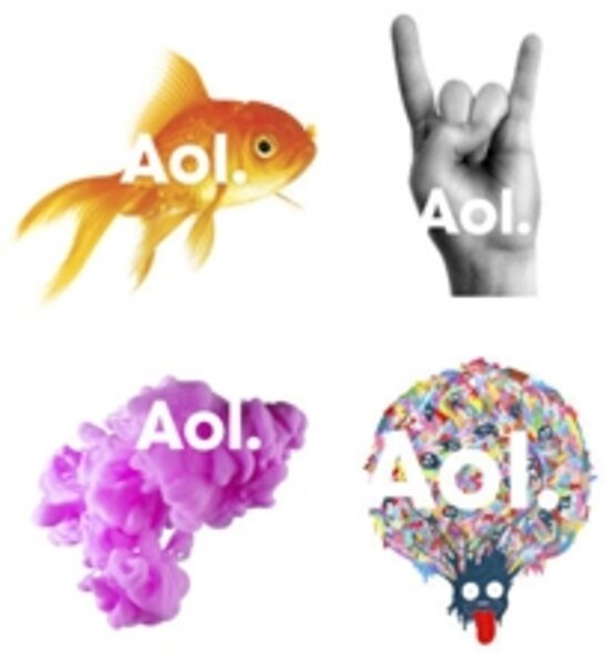
Goodbye, AOL triangle. Hello, AOL goldfish.
Loading...
Back in the day, AOL – the Time Warner-owned company formerly known as America Online – was one of the major gateways to the Internet. But as the Web has expanded, AOL has struggled to stay relevant. Now, the media giant has unveiled a new logo, which AOL executives hope will reinvigorate the brand.
The logo, pictured at right, uses a mixture of lowercase and uppercase type, and adds a period at the end of the company title. AOL plans to display the words over a variety of images, including a leaf, a fish, a shoe, a neon-green scribble, and an upraised hand. According to the New York Times, AOL has readied hundreds of pictures, which it will roll out over the next few months.
“Historically brand identity has been monolithic and controlling, little more than stamping a company name on a product," said Karl Heiselman, CEO of Wolff Olins, the firm which designed the rejiggered AOL logo. "AOL is a 21st century media company, with an ambitious vision for the future and new focus on creativity and expression, this required the new brand identity to be open and generous, to invite conversation and collaboration, and to feel credible, but also aspirational."
Not everyone is so upbeat. The Guardian conducted an informal poll of professional designers, most of whom wrote off the new AOL logo as uninspired and uninspiring.
"I like the idea of changing and adaptive logos, but this is such a literal and clichéed attempt at it," said Florian Schmitt, an employee of the London-based design agency Hi-Res! "I happen to know that they had very little time to finish this, but even so, this is poor. It's literally the first thing you would do as a moodboard and the first thing you would put in the trash as well."
Oliver Reichnestein, the creative director of Tokyo based design agency Information Architects Inc., was more forceful still:
Radical identity changes usually suggest that there is something wrong with the company. Well, we all know what's wrong with AOL. Their original business (Internet access) is obsolete. Dropping all visual keys and forcing the logo to a negative appearance on random images surely is a drastic measure. If the goal of the redesign was to illustrate how the company is slowly vanishing from the fast changing digital surface of the planet, I'd say: Job well done.
The logo redesign comes at a momentous time for AOL, which is about to be spun off from Time Warner. The new AOL logo will be officially unveiled on Dec. 10, the first day AOL will be traded independently on the New York Stock Exchange.
What are your impressions of the new AOL logo? Leave a comment or join the conversation on Twitter – we’re @CSMHorizonsBlog.


