What the Google+ reboot says about the company's 'social' future
Loading...
When Google launched Google+ in 2011, the company had lofty goals for the nascent social network. Google+ was supposed to compete with Facebook by taking Google’s considerable store of user data and augmenting it with personal information such as birthdays, photos, likes, and dislikes.
The service was widely praised for its approach to photos and its nuanced privacy features (which came only after the company experienced a highly-visible privacy failure with Google Buzz, its predecessor social network). A leaked memo that year even showed that Google staked its employees’ bonuses on the company’s success at creating a social network.
But Google+ never quite caught on the way the company predicted it would. As users failed to embrace the new social network, Google began spinning off features one by one. Photos got its own app; so did the Hangouts chat feature. Google announced that it would “pivot” the central social concept behind Google+, to see if there might yet be a purpose for the network itself.
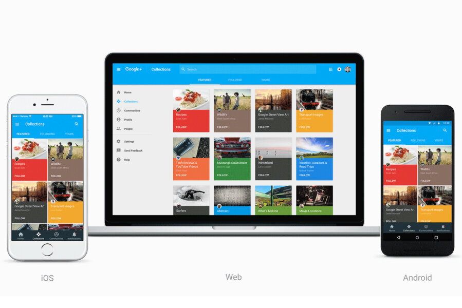
On Tuesday, Google announced that it’s relaunching that network. But rather than a catch-all Google+ designed to supplant Facebook as people’s primary social network, the redesigned Google+ is simpler and slimmer.
The new Google+ is designed around two features, Communities and Collections, which are meant to unite people around shared interests. The implementation is similar to that of social news platform Reddit, which divides its content into different subreddits with topics ranging from technology to minimalism to chess.
If you opt in to the new Google+ (web only for now, though the company says new Android and iOS apps are coming soon) you’ll be presented with a list of popular Communities and Collections that you might be interested in following. Communities are groups of individuals sharing links, tips, and articles about a shared interest such as Javascript coding or crock pot cooking. Collections are groups of posts by a single author on a topic of interest, such as an artist’s portrait photographs or an Android enthusiast’s app reviews. Those features have been present in Google+ for years, but since they’re the most popular services, they’re now being put front and center.
“Now focused around interests, the new Google+ is much simpler,” Eddie Kessler, Google’s Director of Streams, wrote in a blog post. “And it’s more mobile-friendly—we’ve rebuilt it across web, Android and iOS so that you’ll have a fast and consistent experience whether you are on a big screen or small one.”
With the new network, Google seems more content to offer a simple product that “solves real needs,” in Mr. Kessler’s words, rather than a sprawling, ambitious piece of software that may or may not actually appeal to users.


