Apple iOS 7 review roundup: new apps, new Control Center, new look
Loading...
Today marks the launch of iOS 7, Apple's latest mobile operating system. Depending on your location (handy chart here), you should get a push notification alerting you to the update. Otherwise, you can navigate to the Software settings on your phone and get the ball rolling yourself. So what's new in iOS 7? Well, just about everything: New design, new Siri, new Camera app, and a new control center, in the form of a handy little pop-up menu.
But how good is the new OS, anyway? Let's go to the reviews.
The aesthetics, part one
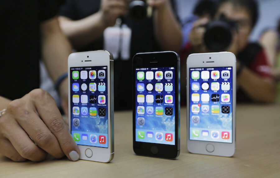
"iOS 7, along with the iPhone 5C, represent the return of Apple's embrace for color," writes Scott Lowe of IGN. "Bright, saturated hues are pervasive throughout the new design, most notably in its new revised "flat" app icons. The glossy, bubble-like app launchers have been replaced with 2D variations that draw from the same iconography, save for a few exceptions. In many cases, the changes have been for the better."
The aesthetics, part two
"Apple’s visual overhaul received a lot of knee-jerk criticism when it was revealed at WWDC earlier this year, but in practice, the visual changes are actually quite pleasant, and grow on a user with time," writes Darrell Etherington of TechCrunch. "Looking back now, iOS 6 feels dated, despite the fact that when I first started using iOS 7 I felt it was inferior in terms of look and feel to the older OS. Apple’s new look with iOS 7 takes acclimating, but on the whole, it’s an improvement."
The aesthetics, part three
"Screenshots don’t do it justice," writes Martin Bryant of The Next Web. "From the zooming, focus-pulling transitions as you switch between apps and the gaussian blur applied to overlaid menus, to the subtle animation effect applied to wallpapers that makes it appear as if they’re tilting ‘inside’ your device as it moves in your hand, iOS 7 feels ‘alive.' "
The control center
"I love it," gushes Zach Epstein of BGR. "Apple is finally offering users a simple and elegant solution to provide access to common settings, controls and apps. A swipe up from the bottom of any screen reveals the new panel, which includes an airplane mode toggle, a Wi-Fi toggle, a Bluetooth toggle, a Do Not Disturb toggle, a rotation lock toggle, a flashlight toggle (to illuminate the camera flash), a display brightness slider, music playback controls, AirDrop, AirPlay and quick access to the Clock app, the Calculator app and the Camera app."
The new Siri
"In line with iOS 7's new look, Siri now sports a different appearance," writes Steven Sande of TUAW. "When you invoke Siri by either lifting your iPhone to your ear or pressing your iOS device's home button for two seconds, a line appears on the screen. That line turns into a 'sound wave' mimicking your voice pattern when you begin talking – it's Siri's way of telling you it is listening to you."
The almost hidden perk
"[T]here’s another welcome improvement in iOS 7: the ability to enable or disable cellular data use on an app-by-app basis," writes Dan Moren of MacWorld. "It’s hiding under the Settings > Cellular section, and you might also notice that below each app is an amount, like 1.1MB or 29.6KB – that’s how much data that app has transferred over your cellular connection since the last time you used the Reset Statistics button at the bottom of the screen."
The camera app
"The camera now gets eight filters, picked from a 3×3 grid (the center tile selects 'none'), and they’re pretty great," writes Charlie Sorrel of Cult of Mac. "These filters are lossless, so you can remove them from the photo at any time in the future, and also choose other filters in the Edit mode of the photos app (currently, the edit section is the only place you can apply filters on the iPad, and presumably on the iPhone 4/S – I don’t have one to test)."
The photo library
"The app that displays all your photos used to be a single endless scroll of tiny thumbnails," notes David Pogue of the New York Times. "Navigationally speaking, it was really pretty useless. Now it self-assembles into clusters by year, by month and by occasion (based on time and location data). Sooooo much better."
The last word
"Yes, iOS 7 is a big change, but it is one that is worthwhile and finally pulls us away from the first iPhone that was introduced six years ago," concludes Joanna Stern of ABC News. "Apple had to change and now so do we."


