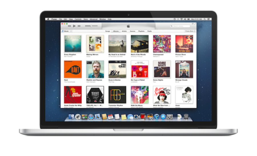
iTunes 11: Sleeker, skinnier, faster
Loading...
Back in September, at the iPhone 5 launch event in San Francisco, Apple demoed a new version of its venerable iTunes platform. Today, iTunes 11 goes live, and as Apple promised, the software is significantly overhauled, from the sleek design to the glowing blue iTunes icon.
The tagline of the new iTunes is "simplicity is a beautiful thing," a nod to the gobs of white space and clean, sharp lines that define the interface. A pull-down menu in the upper-left of the display allows users to click between movies, music, TV, apps, and books – select one of the categories, and you get an uncluttered look at your record collection or digital book shelf.
"It’s browsing made more intuitive," Apple says.
In addition, Apple has refreshed its iTunes Store to match the aesthetic of the iTunes player, and added something called a Mini Player for the desktop.
But our favorite addition to iTunes 11 is the enhanced iCloud functionality – as soon as we booted up the new software, iTunes presented us with a synced list of music and movies we'd collected on a range of other Apple devices, including our iPhone and iPad. You can stream that content from the cloud or download it to your hard drive.
So how does the new iTunes handle? Well, we've only had limited time with it, but it seems pretty snappy to us. And over at Gizmodo, Kyle Wagner agrees. "iTunes is fast now," Wagner writes. "Which is crazy. iTunes hasn't been fast in years. But iTunes 11 feels legitimately lightweight and like something you wouldn't mind running all the time. That's a huge change. Search, scrolling, anything – in any view – is all lightning quick now."
If you own an Apple device, you should get a prompt to download the new iTunes the next time you check your software update queue. If not, navigate over to this page, and download it yourself.
Tried out the new iTunes? Drop us a line in the comments section. And for more tech news, follow us on Twitter @venturenaut.


