The essence of the Monitor – refreshed
Loading...
Perhaps you’ve already noticed something different about your Monitor Weekly. This issue marks the launch of a refreshed design.
Why did we do it? The simple answer is that, increasingly, we’re not thinking of ourselves as a Weekly and a Daily and a website. We think of ourselves as The Christian Science Monitor, and we want all the different ways we publish to reflect that unity.
We also want to provide the best reader experience, so the designers and Weekly staff conducted extensive user testing, sitting down with not only subscribers but also people unfamiliar with the Monitor.
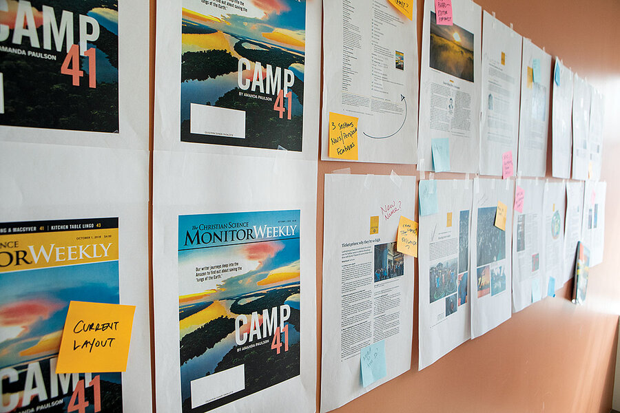
What differences will readers see? Designers Julie Fallon, Jake Turcotte, and Karen Norris explain the changes.
Organization. The Weekly is now organized into three sections: news, perspectives, and arts and culture. The cover story, for instance, now starts in the center spread. The idea, Jake says, is that “we wanted the cover story to be the finale of the news section ... before we get into essays, editorials, and features. [And] ... because of the way the magazine is bound, it naturally opens to the cover story.”
The designers also discovered that many readers start reading from the back, so they put some of our most popular features there, such as In Pictures.
Look. The idea was to bring the Weekly and Daily into closer alignment. That meant using the same color palette and also creating more white space. “We wanted the design of the magazine to give the content some space to breathe, to let the design reflect our unique approach to journalism, and to let readers take a step back to think about the ideas behind the news,” Jake says.
One thing the designers also heard loud and clear was how much readers love our photographs. “Julie really worked hard to enlarge the size of the photos ... between Viewfinder, which starts in the beginning of the magazine, and In Pictures, which ends the magazine,” says Karen.
“It’s a really lovely set of visual bookends. And filtered through the magazine ... the photos are enlarged. So visually there’s a lot going on,” she says.
Content. Not many changes here. Virtually everything that was in the Monitor last week you will find this week. There are two notable differences.
First, the section previously known as “Heart of the News” has been renamed “Humanity Behind the Headlines.” Some readers found the old title confusing; the new title conveys the essence of the section more clearly. And second, stories in the Humanity section will now have an element called “Why We Wrote This,” which is something we pioneered in a previous iteration of the Weekly.
“We hope to continue more of those throughout our longer stories, such as the cover story, and some of our science stories,” Karen says.
The new design is all a part of constantly refreshing the Weekly to make it better fit readers’ needs. Says Julie: “It’s a living thing. It should always be living and evolving, and we’re always getting feedback from readers.”


