Will income inequality get even worse?
Loading...
I’m compelled to write a bunch about inequality.
What are the facts of the case (my CBPP colleagues are doing great stuff on this that I want to promote)?
Why has it gone up so much?
Why does it matter?
Where is it headed?
Why so much interest in it right now?
Is it a political force?
So let’s start with facts of the case.
If you want to quickly and efficiently get up to speed on the income inequality story in the US—and who doesn’t?—read this from my CBPP colleagues. It takes you pretty far into the weeds on data sources and the like, but this is one of those economic issues where the sources matter a great deal. Series that fail to include realized capital gains, for example, will miss important dynamics going on in the upper tail of the income scale.
Here’s their summary of the broad trends:
- The years from the end of World War II into the 1970s were ones of substantial economic growth and broadly shared prosperity.
- Incomes grew rapidly and at roughly the same rate up and down the income ladder, roughly doubling in inflation-adjusted terms between the late 1940s and early 1970s.
- The income gap between those high up the income ladder and those on the middle and lower rungs — while substantial — did not change much during this period.
- Beginning in the 1970s, economic growth slowed and the income gap widened.
- Income growth for households in the middle and lower parts of the distribution slowed sharply, while incomes at the top continued to grow strongly.
- The concentration of income at the very top of the distribution rose to levels last seen more than 80 years ago (during the “Roaring Twenties”).
- Wealth (the value of a household’s property and financial assets net of the value of its debts) is much more highly concentrated than income, although the wealth data do not show a dramatic increase in concentration at the very top the way the income data do.
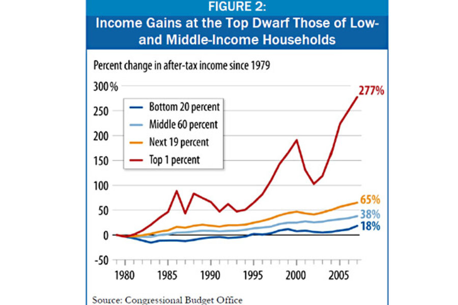
The above picture from recent CBO data, which are among the best for understanding the trend in income inequality over the past few decades, is quite revealing of where the Occupy folks are coming from with the 99/1 framing.
One thing to note here is the large decline in gains to the top 1% after the dot.com bust. That’s a function of the decline in asset values which led to large capital losses for high-end households. The CBO data end in 2007 but you can be sure the top took another hit with the bursting of the housing bubble and the ensuing financial meltdown.
In fact, IRS data, which go through 2009, show the share of adjusted gross income going to the top 1% to have fallen sharply in 2008 and 2009, from around 23% in 2007 to 17% in 2009.
But that’s expected. The question is whether it’s cyclical or structural and the answer is that it’s almost certainly the former. Note the huge bounce back in the growth of top incomes once the economy recovered. Since the underlying forces generating the increasingly unequal distribution of growth remained in place, there was no reason to expect a structural downshift (more on those forces in later posts, but here’s an earlier post that gets into that material).
What does the future hold in this regard? Will inequality, as measured by the share going to the top 1%, start climbing again soon?
I’m quite certain it will as the forces stoking its growth remain in place. One way to test this hypothesis is to look at the correlation between the growth at the top of the income scale and corporate profits, for which we have data through 2010, and which have fully regained their stellar prerecession peak.
The figure shows the result of a simple model regressing the CBO top 1% series on corporate profits (as a share of income) and a time trend (other than the time trend, I use the changes in the variables). It’s a simplistic model–nothing you’d want to take home to your parents–just “blogometrics.” But what we’re looking for here is whether the forecasted series (in red) ticks up in 2010…and there it is.
The forces driving inequality in America remain, unfortunately, alive and well.


