Economic data goofs make the case for metadata
Loading...
Harvard historian Niall Ferguson goofed on Bloomberg TV yesterday. Arguing that the 2009 stimulus had little effect, he said:
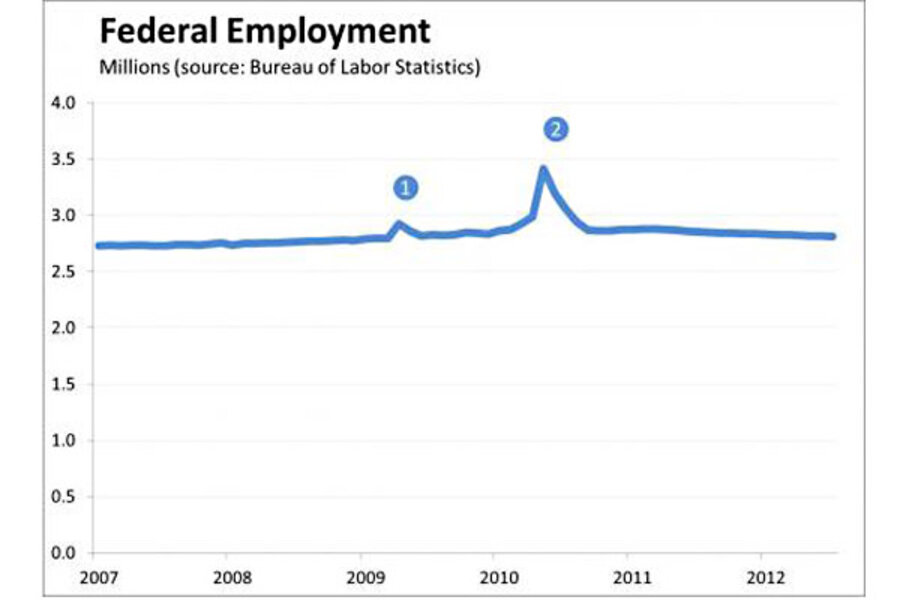
The point I made in the piece [his controversial cover story in Newsweek] was that the stimulus had a very short-term effect, which is very clear if you look, for example, at the federal employment numbers. There’s a huge spike in early 2010, and then it falls back down. (This is slightly edited from the transcription by Invictus at The Big Picture.)
That spike did happen. But as every economic data jockey knows, it doesn’t reflect the stimulus; it’s temporary hiring of Census workers.
Ferguson ought to know that. He’s trying to position himself as an important economic commentator and that should require basic familiarity with key data.
But Ferguson is just the tip of the iceberg. For every prominent pundit, there are thousands of other people—students, business analysts, congressional staffers, and interested citizens—who use these data and sometimes make the same mistakes. I’m sure I do as well—it’s hard to know every relevant anomaly in the data. As I said in one of my first blog posts back in 2009:
Data rarely speak for themselves. There’s almost always some folklore, known to initiates, about how data should and should not be used. As the web transforms the availability and use of data, it’s essential that the folklore be democratized as much as the raw data themselves.
How would that democratization work? One approach would be to create metadata for key economic data series. Just as your camera attachs time, date, GPS coordinates, and who knows what else to each digital photograph you take, so could each economic data point be accompanied by a field identifying any special issues and providing a link for users who want more information.
When Niall Ferguson calls up a chart of federal employment statistics at his favorite data provider, such metadata would allow them to display something like this:
Clicking on or hovering over the “2″ would then reveal text: “Federal employment boosted by temporary Census hiring; for more information see link.” And the stimulus mistake would be avoided.
I am, of course, skimming over a host of practical challenges. How do you decide which anomalies should be included in the metadata? When should charts show a single flag for metadata issues, even when the underlying data have it for each affected datapoint?
And, perhaps most important, who should do this? It would be great if the statistical agencies could do it, so the information could filter out through the entire data-using community. But their budgets are already tight. Failing that, perhaps the fine folks at FRED could do it; they’ve certainly revolutionized access to the raw data. Or even Google, which already does something similar to highlight news stories on its stock price charts, but would need to create the underlying database of metadata.
Here’s hoping that someone will do it. Democratizing data folklore would reduce needless confusion about economic facts so we can focus on real economic challenges. And it just might remind me what happened to federal employment in early 2009.


