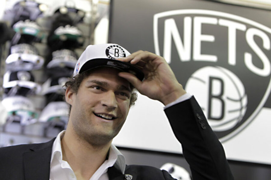
Brooklyn Nets launch new logo. Reactions mixed
Loading...
The newly relocated Brooklyn Nets went one step further in their franchise transformation Monday, releasing a new logo that’s a complete do-over of the red, white, and blue threads of the team’s days in New Jersey.
Designed by hip hop mogul and Nets minority owner Jay-Z, the new Nets logo is monochromatic, retro, and a tad literal. A black, badge-shaped backdrop encases the “NETS” name, written in thin, all caps font. That sits atop a basketball engraved with a “B” for Brooklyn. Another variant has the “B” basketball encircled by the world “Brooklyn New York.”
"The Brooklyn Nets logos are another step we've made to usher the organization into a new era," Jay-Z said in a statement. "The boldness of the designs demonstrates the confidence we have in our new direction. Along with our move to Brooklyn and a state-of-the-art arena, the new colors and logos are examples of our commitment to update and refine all aspects of the team."
The design is inspired in part by the signage of the New York Subway system, according to a statement on the Nets website.
The new logo was unveiled at a press conference in a Modell’s sporting goods store near Barclays Center on Flatbush Avenue – the Nets’ new arena. Nets star Brook Lopez was in attendance, as well as Brooklyn Borough President Marty Markowitz. The Nets are the first major professional sports team to call Brooklyn home since baseball’s Dodgers packed up for Los Angeles in 1957.
The Nets join the San Antonio Spurs, Chicago White Sox, and Oakland Raiders in the ranks of pro teams sporting a noncolor color scheme (a short subway ride away, the New York Yankees could probably be included in this group, but their pinstripes are technically navy). The Nets’ uniforms won’t be unveiled until later this year, probably September.
But shirts hats, and other Nets merchandise are now available, and reactions around the web are decidedly mixed. While some hail the logo as sleek and appreciate the aggressive courting of the urban market (the products are peppered with Jay-Z lyrics and other hip hop references), others complain that they are plain and derivative, some bemoaning the lack of color.
“They’re ugly. I expected more from Jay-Z,” analyst Tony Kornheiser lamented on ESPN’s “Pardon the Interruption.” The logo is the only one in the NBA to use a black and white color scheme, but a column in the Wall Street Journal griped about the tired use of a basketball in the logo, noting that 20 out of the 30 NBA teams also have basketball-centric logos.
But whichever side of the uniform debate wins out, it won’t matter unless the team can turn its fortunes around on the court. During the Nets’ 35 seasons in the NBA, the franchise has never won a championship. They’ve only made it to the NBA finals twice, in 2002 and 2003. The Nets haven’t made the playoffs since 2007. For the shortened 2012 season, they had the worst record in the Eastern Conference's Atlantic Division, at 22 and 44. In a crowded professional sports market like New York, with storied franchises like the Yankees and Knicks, such a history will have a hard time attracting new fans.
But start winning, and the Nets can do anything they want with their team look. Case in point: The University of Miami Hurricanes, a team with five national championships and arguably the sports world's most horrid color scheme. Should the Nets win five titles, nary a soul will be complaining about Jay-Z’s logo design. The San Antonio Spurs have won four NBA titles since 1999, and they wear their black and gray in peace.


